
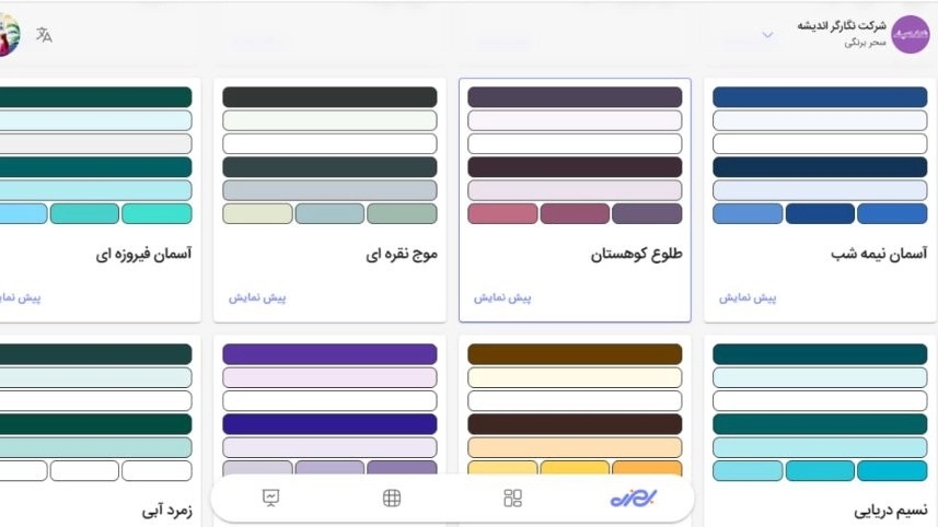
Color palette
"Color palette" (32 SEO-friendly colors) is a tool in the hands of business owners to determine the default color scheme and visual identity of their site and to manage both the beauty of the site and improve SEO and visibility in search engines by creating the possibility of precise filtering of products.
What is meant by SEO colors?
The combination of "color" and "SEO" may seem strange at first glance, but colors can directly and indirectly affect SEO:
- Standard Coding (Schema Markup): SEO colors have standard names and codes (such as Red, Navy Blue, etc.) that search engines like Google know well. When a product with these colors is registered, Google will correctly show the product color to the user in the search results (Rich Snippets) (for example, when a user searches for "buy blue sneakers").
- Accessibility: SEO colors are usually consistent with World Wide Web Standards (WCAG) in terms of contrast. Google gives a higher SEO score to sites that are readable by all users (even people with low vision or color blindness).
- Bounce rate reduction: Standard and beautiful colors improve the user experience (UX). A user who feels comfortable on the site spends more time on it, and this is a positive signal for the site's SEO.
The necessity of having a diverse color palette (32 colors) for business owners
- Compliance with the visual identity of the brand (Branding)
Every business has its own corporate identity and brand color. Limited colors make the site unable to convey the spirit of the brand. The presence of 32 different colors allows the business owner to personalize his site or products exactly according to his corporate color.
- Psychology of colors and increasing sales
Colors have a deep psychological impact on customers' decision making. For example:
- Red: Creating a sense of urgency (suitable for discount and special sale buttons)
- Blue: Inducing a sense of trust and security (suitable for corporate, medical and service sites)
- Green: A symbol of health, nature and peace (suitable for organic products)
Having 32 colors allows the site manager to target the emotions of the audience based on the type of product and sales campaign.
- Filtering and detailed product search
In online stores (such as clothing, furniture, home appliances), color is one of the most important purchasing variables. When you have defined 32 standard colors in the system:
- Customers can easily filter products by color (e.g. see only "crimson" or "mustard" clothing).
- These precise filters create new category pages that are valuable and SEO-friendly for users to search on Google.
- Avoidance of confusion (managed diversity)
My color palette
“My Color Palette” is an advanced personalization feature for Visitors that allows them to change the color scheme of all sites on the Platform based on their personal taste and eye comfort; In this way, each user sees the environment of the sites exactly as he likes, regardless of the default color of the brands.
The necessity of having "my color palette"
1. Ultimate accessibility and eye health
Many users have special vision conditions. Some are sensitive to high light (Photophobia), some have color blindness, and some have trouble reading text on certain backgrounds (e.g. glossy white). Dark Mode, which has become very popular today, is only a simple form of this need. The "My Color Palette" feature allows the user to set the site exactly to a color that is easier on their eyes. This means that your sites will be usable and comfortable for 100% of users, with any vision conditions.
2. Creating a sense of ownership and psychological comfort
Users love control and customization (just like changing the mobile background image). When the user can change the color of the shopping environment in which he is present, an unconscious "sense of ownership" is created in him. He no longer sees your site as a stranger, but considers it an environment that belongs to him and is arranged according to his taste. This sense of comfort directly leads to trust and easier shopping.
3. A significant increase in shelf life (Time on Site)
The main reason that users leave a site quickly (high bounce rate) is eye fatigue or lack of connection with the site's appearance. When the user sees the site with his favorite colors, his eyes get tired later and he is more inclined to browse psychologically. He may spend hours browsing through the products, simply because the environment is pleasant and personalized for him.
4. Integrated experience and loyalty to the platform (Ecosystem Loyalty)
The fact that the user can see all your subcategory sites in the color they want with a single profile setting is a great competitive advantage!
This will make the user addicted to your platform. why Because if he goes to the competitors' sites (outside your system), he will face the imposed and boring colors again. He prefers to shop at stores that are on your platform, because there "everything is in his favorite color".
5. Intelligent solution to the conflict of "site branding" and "user taste".
The business owner may have chosen a bold red color for their site (which makes sense for their brand), but maybe this color is causing a headache for a particular user.
This feature is a win-win solution:
- For 90% of users (normal visitors): The site will be displayed with the same color and brand identity as the business owner (for example red).
- For 10% of users (people who are sensitive or have special tastes): The site will be displayed with their favorite color.
Here, the business owner has kept his branding, but he has not lost that particular customer because of the color of the site, and the user makes his purchase safely.
The difference between "color palette" and "my color palette"
The main difference between these two features is summarized in the decision-making audience and the final application; "Color palette" (32 SEO-friendly colors) is a tool in the hands of the business owner to define the default visual identity of the site, filter products and SEO standards for the general visitors, while "My color palette" is a completely user-oriented possibility at the disposal of the customer (visitor), which allows him to override the default brand colors and customize the environment of all sites in your network based solely on personal taste and convenience. Change your eyes, so that the first one is the guardian of the "branding of the store" and the second one is the guarantor of "customization and absolute convenience of the buyer".